Data Handling and Presentation – Complete Guide For Class 6 Math Chapter 4
Welcome to iPrep, your Learning Super App. Our learning resources for the chapter, Data Handling and Presentation in Mathematics for Class 6th are designed to ensure that you grasp this concept with clarity and perfection. Whether you’re studying for an upcoming exam or strengthening your concepts, our engaging animated videos, practice questions and notes offer you the best of integrated learning with interesting explanations and examples.
The chapter Data Handling and Presentation covers the organization, analysis, and presentation of data. It defines data as facts and observations that provide information and explains how data can be organized in tables with tally marks for easy interpretation. The concept of frequencies, representing the count of occurrences, is introduced. Visual representation of data through pictographs and bar graphs is also explored, with an emphasis on choosing the right scale for accuracy. The chapter highlights the importance of clear and visually appealing data presentation while cautioning against misleading visual elements. Ultimately, by mastering these techniques, students can efficiently interpret and present data in a clear and meaningful way.
Data Handling and Presentation
In this age of information, data surrounds us everywhere—be it in the form of numbers, measures, or observations. But how do we make sense of all this data?
Understanding Data
Imagine asking your classmates about their favorite colors or measuring the weight of each student in your class. The responses or measurements you gather are examples of data.
Definition: Any collection of facts, numbers, measures, observations or other descriptions of things that convey information about those things is called data.
Collecting and Organizing Data
Consider Navya and Naresh, who want to find out the most popular game in their class. They decide to ask each student about their favorite game and create a list of responses. But merely listing the games isn’t enough to identify the most popular one. They need a systematic way to organize this data so they can draw a clear conclusion. This scenario teaches us the importance of collecting and organizing data to make it understandable and useful.
Tally Marks and Data Organization
Tally marks are simple, quick, and effective, especially when dealing with small datasets.
For instance, Shri Nilesh, a teacher, wants to know his students’ preferences for sweets. He uses tally marks to record each student’s choice, making it easier to count and organize the data.
The example of tallying the number of students who prefer jalebi, gulab jamun, gujiya, barfi, or rasgulla illustrates how to tally marks help in organizing data before presenting it visually.
Sweets Tally Marks Number of Students Jalebi IIII I6 Gulab jamun IIII IIII9 Gujiya IIII IIII III13 Barfi III 3 Rasgulla IIII III8
Pictographs: A Visual Representation
A pictograph is a visual tool used to represent data without writing any numbers. It uses pictures or symbols to depict data, making it easy to interpret at a glance.
For example, a pictograph can represent different modes of travel used by students, with each picture representing one student. Pictographs are helpful in answering questions like:
Modes of Travelling Number of Students 🧑💼= 1 student Private Car 🧑💼🧑💼🧑💼🧑💼 Public Bus 🧑💼🧑💼🧑💼🧑💼🧑💼 School Bus 🧑💼🧑💼🧑💼🧑💼🧑💼🧑💼🧑💼🧑💼🧑💼🧑💼🧑💼 Cycle 🧑💼🧑💼🧑💼 Walking 🧑💼🧑💼🧑💼🧑💼🧑💼🧑💼🧑💼
Pictographs help answer questions like:
- Which mode of travel is used by the most number of students?
- Which mode of travel is used by the least number of students?
Through pictographs, we can easily compare the frequencies of different categories and make quick inferences. However, creating pictographs can be challenging when dealing with large amounts of data or when the frequencies are not exact multiples of the symbols used.
Drawing a Pictograph – Challenges
Let’s understand this Example
Lakhanpal, Jarina, and Sangita faced challenges while creating pictographs for the number of students present in each class. While Lakhanpal used one symbol to represent one student, Jarina and Sangita opted to use symbols representing multiple students to save time and space. However, they encountered difficulties when the total number of students wasn’t an exact multiple of their chosen symbols.
Pictographs are a powerful tool for representing data visually, but they require careful planning, especially when the data is large or complex. Understanding how to use symbols effectively and choosing an appropriate scale or key is essential for accurate data handling and presentation.
Important Points to Consider When Drawing a Pictograph
As stated in the chapter on data handling and presentation,
- Pictographs are an effective visual method for representing data. They use pictures or symbols to represent data points.
- Pictographs can help answer questions and draw inferences about data with just a quick glance. For example, they can illustrate the most common modes of conveyance, the number of students absent, etc.
- By reading a pictograph, we can quickly understand the frequencies of different categories (e.g., cricket, hockey) and compare these frequencies.
- In a pictograph, categories can be arranged horizontally or vertically. Simple pictures or symbols are then drawn in the designated columns or rows according to the frequency of each category.
- A scale or key (e.g., 1 symbol = 1 student or 1 symbol = 5 students) is added to show what each symbol or picture represents. Each symbol or picture can represent one unit or multiple units.
- It can be more challenging to prepare a pictograph when the amount of data is large or when the frequencies are not exact multiples of the scale or key.
Understanding Bar Graphs
Bar graphs, similar to pictographs, are visual tools that help us quickly understand and interpret data. They allow us to compare values across different categories and identify the highest or lowest values at a glance. However, bar graphs are particularly useful when dealing with large amounts of data, as representing such data with pictographs can be time-consuming and challenging.
Key Points:
- Like pictographs, bar graphs give a nice visual way to represent data. They represent data through equally-spaced bars, each of equal width, where the lengths or heights give frequencies of the different categories.
- Each category is represented by a bar where the length or height depicts the corresponding frequency (for example, cost) or quantity (for example, runs).
- The bars have uniform spaces between them to indicate that they are free standing and represent equal categories.
- The bars help in interpreting data much faster than a frequency table. By reading a bar graph, we can compare frequencies of different categories at a glance.
- We must decide the scale (for example, 1 unit length = 1 student or 1 unit length = ` 200) for a bar graph on the basis of the data including the minimum and maximum frequencies, so that the resulting bar graph fits nicely and looks visually appealing on the paper or poster we are preparing. The markings of the unit lengths as per the scale must start from zero.
Example:
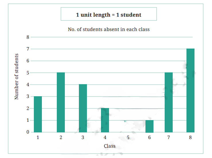
Let’s consider data collected by Lakhanpal regarding the number of students absent in each class on a particular day:

This data can be represented in a bar graph, where 1 unit length equals 1 student.

Drawing a Bar Graph
As stated in the chapter Data Handling and Presentation, To create a bar graph, we need to follow these steps:
- Draw a horizontal line (x-axis) and a vertical line (y-axis).
- Label the x-axis with the categories (e.g., classes or items) and the y-axis with the frequency (e.g., the number of students or the amount of expenditure).
- Choose an appropriate scale for the y-axis. For instance, if the frequencies are large, you might use a scale where 1 unit length represents 10 students.
- Draw bars corresponding to each category with heights proportional to the frequencies.
Example:
Vehicular Traffic: The number of vehicles passing through a crossing in Delhi each hour from 6 a.m. to 12:00 noon can be shown using a bar graph.
The graph shows that the maximum traffic occurred between 7–8 a.m., with 1200 vehicles, and the minimum traffic occurred between 6–7 a.m., with 150 vehicles.

Artistic and Aesthetic Considerations
As stated in the chapter Data Handling and Presentation, beyond the basic steps of data presentation, artistic and aesthetic aspects also play a role in making visual data displays more engaging and effective. When creating pictographs or bar graphs, it’s crucial to ensure they fit within the intended space, which can be managed by choosing an appropriate scale. Additionally, making the presentation visually appealing and easy to understand enhances the audience’s appreciation of the information.
When preparing bar graphs, it’s essential to consider the following:
- Scale: Choose a scale that fits the data well within the intended space.
- Visual Appeal: Make the graph visually appealing and easy to understand.
Example:
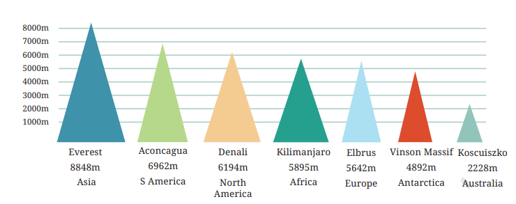
Here is a table naming the tallest mountain on each continent, along with the height of each mountain in meters.
Infographics
According to the chapter Data Handling and Presentation, when bar graphs and other data visualizations are enhanced with extensive artistic and visual elements, they become known as infographics. Infographics are designed to use eye-catching and engaging visuals to convey information more clearly, quickly, and in an aesthetically pleasing manner.
For instance, in an infographic comparing the heights of the tallest mountains on each continent, using triangles instead of rectangles may imply that taller mountains are also wider, which may not be accurate.

While preparing visually appealing presentations of data, we also need to be careful that the pictures we draw do not mislead us about the facts. In general, it is important to be careful when making or reading infographics, so that we do not mislead our intended audiences and we, ourselves, are not misled.
In conclusion, mastering the concepts in CBSE Class 6th Math, Chapter 4 – Data Handling and Presentation is essential for effectively organizing, interpreting, and presenting data. Through tools like tally marks, pictographs, and bar graphs, students can learn how to represent information clearly and accurately. Whether using symbols in pictographs or bars in bar graphs, it’s important to choose appropriate scales and maintain visual clarity to avoid misleading interpretations. With the help of iPrep’s engaging resources, students can easily grasp the techniques taught in Data Handling and Presentation.
At iPrep, our learning resources for Data Handling and Presentation ensure students gain confidence in handling data in real-life situations. By understanding the chapter thoroughly, students can organize and present data effectively, preparing them for future academic challenges. Don’t miss out on our detailed animated lessons and practice exercises to master CBSE Class 6th Math, Chapter 4 – Data Handling and Presentation, and excel in your exams!
Practice questions on Chapter 4 - Data Handling and Presentation
Get your free Chapter 4 - Data Handling and Presentation practice quiz of 20+ questions & detailed solutions
Practice Now


