Smart Charts – Complete Guide For Class 4 Math Chapter 14
Welcome to iPrep, your Learning Super App. Our learning resources for Class 4 Math Chapter 14 – Smart Charts in Mathematics for Class 4th are designed to ensure that you grasp this concept with clarity and perfection. Whether you’re studying for an upcoming exam or strengthening your concepts, our engaging animated videos, practice questions and notes offer you the best of integrated learning with interesting explanations and examples.
Understanding data and its representation is an essential skill in today’s information-driven world. As students encounter various forms of data in their daily lives, from school assignments to news reports, the ability to interpret and present this information becomes crucial. The “Smart Charts” chapter introduces students to the fundamental concepts of data handling, empowering them to collect, organize, and visually represent information engagingly. Mastering these skills not only enhances their mathematical abilities but also prepares them for real-life scenarios where data interpretation is vital. Let’s now understand what exactly does smart charts mean.
What Are Smart Charts?
“Smart Charts” refers to the visual representation of data using various tools like pictographs, tally marks, and bar graphs, making it easier to analyze and compare information at a glance. This chapter teaches students how to effectively communicate data clearly and engagingly. The “Smart Charts” chapter teaches students the fundamentals of representing data with straightforward diagrams and charts. Learning how to gather, arrange, and visually represent data enables students to quickly recognize trends, patterns, and comparisons.
The chapter “Smart Charts” provides methods for successfully representing data by going over key ideas such as pictographs, bar charts, and tally marks. Students study how data can be evaluated and applied to create decisions by using real-world examples. They also hone their observational and critical thinking abilities by analyzing charts. The chapter Smart Charts also promotes active engagement by allowing students to build their charts based on real-life data, such as surveys or observations in the classroom or at home. “Smart Charts” helps students grasp data handling, an essential mathematical ability that is applied in daily life, and prepares students for advanced statistical ideas in higher grades.
“Smart Charts” introduces students to one of the most practical and essential skills in mathematics – data handling and representation. The ability to collect, organize, and present data visually using charts is a skill that not only helps in mathematics but also in making sense of the world around us. From survey results to understanding trends and making decisions, data representation is key. This chapter focuses on using simple tools like pictographs, bar graphs, and tally marks, and understanding the process of reading and creating charts.
What is Data?
Students need to understand what data is before they can work with charts. A collection of facts or information is referred to as data. Data is present in every aspect of daily life, such as the quantity of books in a library, the number of students in a class, and the results of a cricket match. Data is often gathered to address particular issues or assist in decision-making. It can be either qualitative or quantitative.
Example:
If a teacher asks how many students like different fruits (apples, bananas, oranges), the number of students liking each fruit is considered data.
Organizing Data
As mentioned in the chapter “Smart Charts”, After data is collected, it must be arranged to make it simple to read and evaluate. Raw data can be complex and frequently unorganized. Sorting or categorizing data will allow it to be arranged logically. This is known as organizing data. Selecting the most effective way to display data is an essential phase in data organization, which brings us to charts and graphs.
Example:
A survey was conducted in a class to find out which mode of transport students use to come to school. The raw data might look like this:
- Bus
- Car
- Walk
- Bicycle
- Car
- Walk
This data needs to be organized into categories to make it meaningful, such as:
- Bus: 1
- Car: 2
- Walk: 2
- Bicycle: 1
Pictographs
As a part of Smart Charts, a pictograph is a chart in which the data is represented by pictures or symbols. Every image or symbol represents a specific amount of things. Because they are visually appealing and facilitate data understanding, pictographs are especially helpful for younger students.
Key Aspects of Pictographs:
- A symbol or picture is used to represent a specific number of items.
- A key is provided to indicate the value of each symbol.
- Pictographs help in quickly comparing different categories of data.
Example:
A pictograph can be used to represent how many apples, bananas, and oranges are liked by students in a class:
Fruit Number of Students 🍎 Apples 🍎🍎🍎🍎 (4 students) 🍌 Bananas 🍌🍌 (2 students) 🍊 Oranges 🍊🍊🍊 (3 students)
Here, one fruit symbol represents one student.
How to Read a Pictograph:
Just count the symbols in each row of a pictograph and use the key to determine what each symbol means to interpret the data. This will help in identifying the represented quantity.
Tally Marks
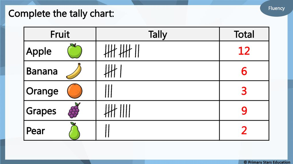
Using vertical lines, and tally marks is an easy way to record and count data. Four vertical lines are drawn for each of the four things. A diagonal line is placed across the four vertical lines for the fifth item, creating a group of five. Large quantities are easier to count when grouped like this.
Key Aspects of Tally Marks:
- Tally marks group data in sets of five, making counting faster and easier.
- They are particularly useful for surveys or when counting votes, objects, or occurrences.
Example:

How to Use Tally Marks:
- Each vertical line represents one count.
- When you reach five counts, draw a diagonal line across the previous four.
- Continue grouping the tally marks in sets of five.
Bar Graphs
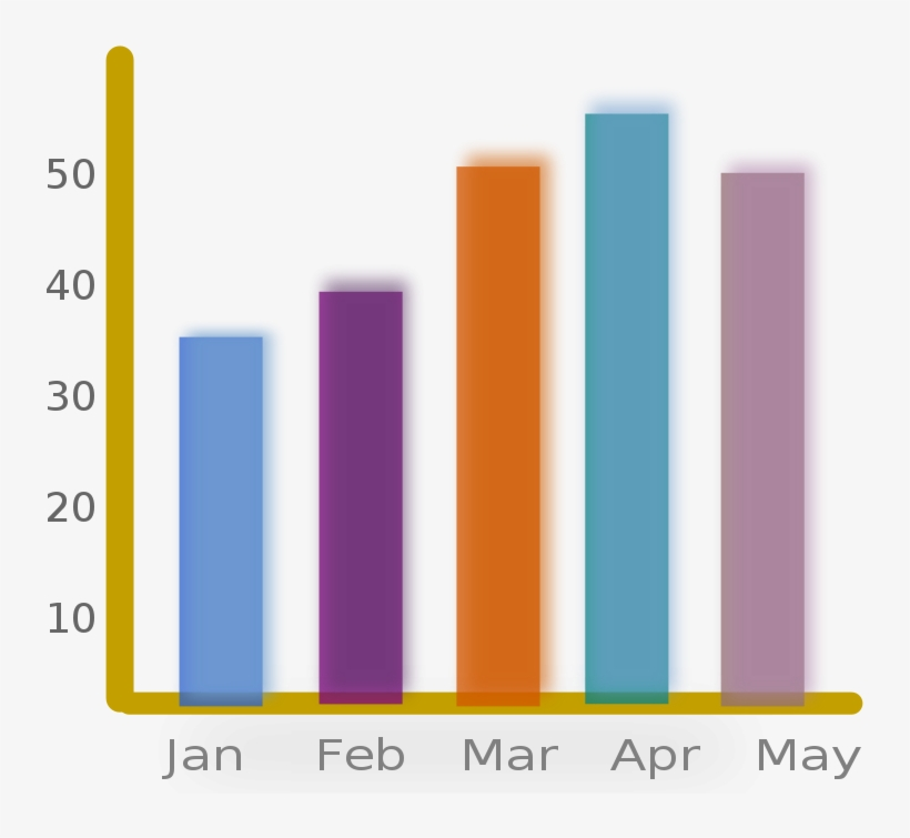
Another kind of Smart Charts that uses rectangular bars to display data is called a bar graph. The quantity that each bar in a horizontal bar graph represents is shown by its length (or height). One of the most popular forms of data visualization is the bar graph, which offers a simple and unambiguous visual comparison between groups.
Key Aspects of Bar Graphs:
- Each category is represented by a bar.
- The height of the bar indicates the value or quantity for that category.
- Bar graphs allow for easy comparison between different groups.
Example:

Reading a Bar Graph:
To interpret a bar graph:
- Look at the categories along one axis (typically the x-axis).
- Check the numbers on the other axis (typically the y-axis) to determine the quantity each bar represents.
- Compare the heights of the bars to understand the differences between the categories.
Pie Charts
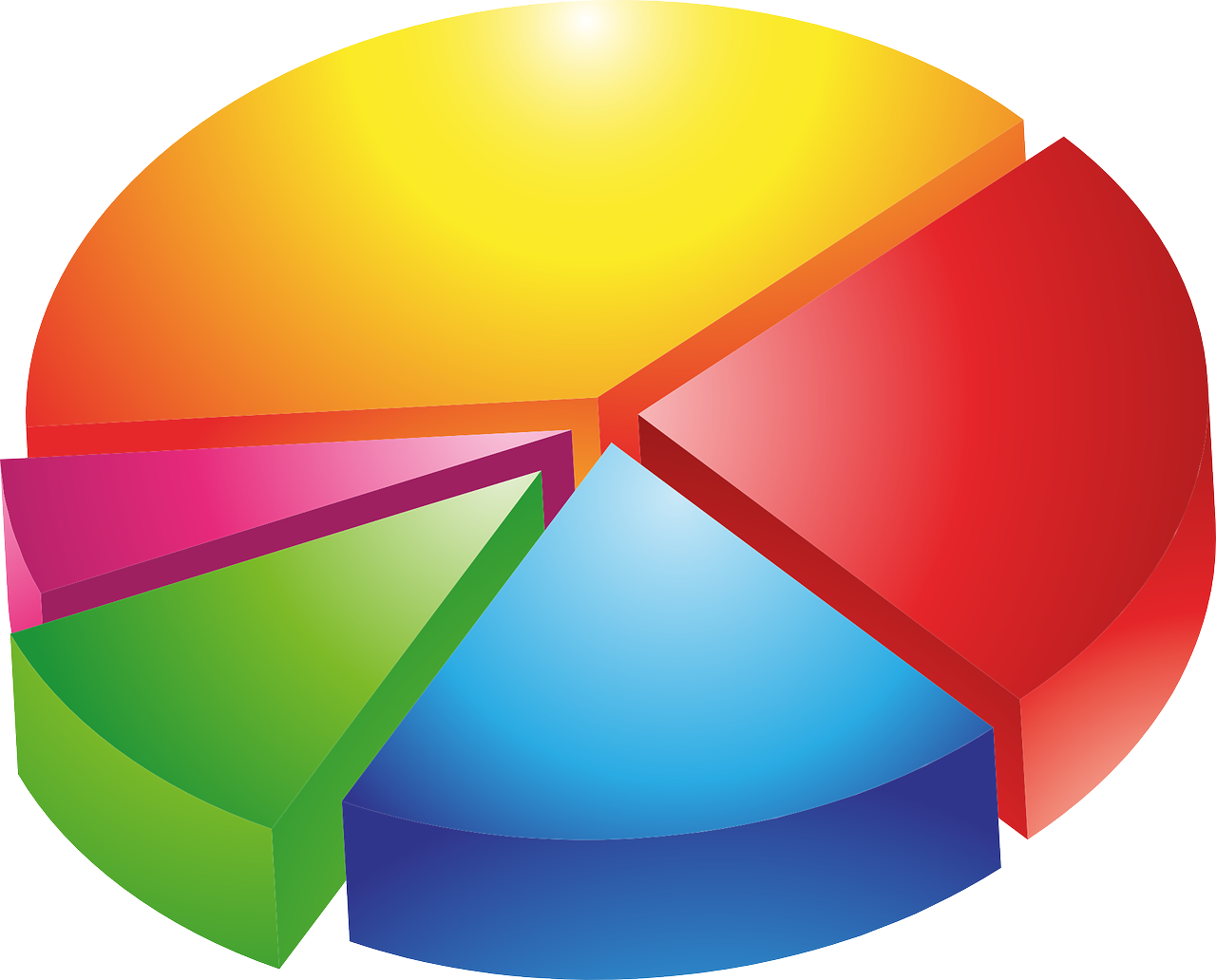
As a significant part of Smart Charts, a pie chart is a circular chart that is divided into sections, or “slices,” to represent different parts of a whole. Each slice of the pie shows how much of the total something represents. The larger the slice, the bigger the portion of the whole it stands for.
How to Read a Pie Chart:
- Look at the whole circle to understand it represents 100% of something.
- Check the size of each slice to see how much of the whole it represents.
- The biggest slice means the most, and the smallest slice means the least.
By using a pie chart, students can learn how to visualize data in a fun and easy way!

Creating Charts
Students are encouraged to create their charts and graphs based on real-world data. This hands-on activity helps solidify their understanding of how data can be visually represented. Teachers can ask students to gather data from their surroundings (e.g., favorite sports, modes of transport, etc.) and represent it using pictographs, tally marks, or bar graphs.
Example Activity:
Conduct a simple class survey where students vote on their favorite colors. Record the data using tally marks and then represent it as both a pictograph and a bar graph. This process will allow students to see how the same data can be represented in multiple ways.
Interpreting Data
Reading and interpreting data from charts is an essential skill. After creating or reviewing a chart, students should be able to:
- Identify the highest and lowest values.
- Make comparisons between categories.
- Conclude the data.
Example:
In a bar graph showing the favorite sports of students, if football has the tallest bar and basketball has the shortest, students can conclude that more students prefer football over basketball.
Real-Life Applications of Smart Charts
Data representation is not limited to classrooms; it plays an important role in real life. Charts and graphs are used in news reports, businesses, schools, and sports to provide information quickly and clearly. By understanding how to read and create these charts, students gain a skill that will be useful throughout their lives.
Examples:
- Weather Reports: Temperature variations are often shown using bar graphs.
- Business: Bar graphs are used to show sales performance over time.
- Sports: Scoreboards often display performance statistics using charts.
Comparing Different Types of Smart Charts
Each of the types of Smart Charts has its advantages depending on the kind of data being represented. Students need to understand when to use a pictograph, tally marks, or a bar graph. For example:
- Pictographs are great for younger students or when you want a fun, visual representation of data.
- Tally Marks are useful for counting and recording data as it occurs.
- Bar Graphs are ideal for comparing different categories of data at a glance.
Solving Word Problems Involving Charts
The chapter also encourages students to solve word problems that involve reading and interpreting data from charts. These problems help students apply their knowledge to practical situations.
Example Problem:
A bar graph shows the number of ice cream cones sold in a week: 10 on Monday, 12 on Tuesday, 8 on Wednesday, 15 on Thursday, and 9 on Friday. Students might be asked questions like:
- On which day were the most ice creams sold?
- How many ice creams were sold in total over the week?
Conclusion
In conclusion, the “Smart Charts” chapter equips Class 4 students with essential skills in data representation that are crucial for both academic success and real-world applications. By mastering techniques such as pictographs, tally marks, and bar graphs, students learn how to effectively organize and analyze data. The hands-on activities in the chapter encourage engagement and foster critical thinking, allowing students to apply their learning to everyday situations.
Moreover, the practical understanding gained from the “Smart Charts” chapter prepares students for more advanced mathematical concepts in the future. As they navigate through their educational journey, the ability to interpret and present data will serve them well in various subjects and everyday decisions. Ultimately, “Smart Charts” not only enhances students’ mathematical proficiency but also empowers them to communicate information clearly and thoughtfully.
Practice questions on Chapter 14 - Smart Charts
Get your free Chapter 14 - Smart Charts practice quiz of 20+ questions & detailed solutions
Practice Now


