Data Handling – Complete Guide For Class 8 Math Chapter 5
Welcome to iPrep, your Learning Super App. Our learning resources for the chapter, Data Handling in Mathematics Class 8th Chapter 5 are designed to ensure that you grasp this concept with clarity and perfection. Whether you’re studying for an upcoming exam or strengthening your concepts, our engaging animated videos, practice questions and notes offer you the best of integrated learning with interesting explanations and examples.
In the chapter on Data Handling, students learn how to collect, organize, and interpret data. This chapter covers various methods and graphical representations to make data analysis more meaningful and insightful.
Data Handling involves collecting, organizing, and interpreting data. In Class 8, students learn to represent data using bar graphs, pie charts, and histograms, and analyze it using measures like mean, median, and mode. This unit develops critical thinking and analytical skills essential for understanding real-world information.
Basic Information
To learn more about Data Handling in class 8 chapter 5, we will seek some basic information first.
- Data: The collected information is called data.
- Raw Data: Data in its original form is known as raw data.
- Systematic Organization: To draw meaningful conclusions from data, it must be systematically organized.
Pictograph
A pictograph represents data using pictures, making it visually easy to understand. For example, the following pictograph shows the number of computers sold by a company over five days:
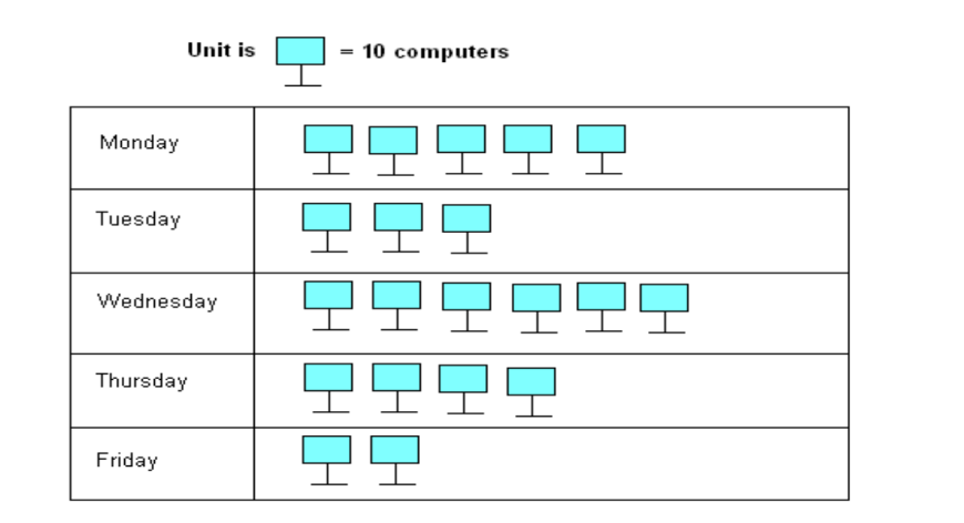
Total computers sold: 200 computers.
Bar Graph
A bar graph displays information using bars of uniform width, where the height of each bar is proportional to the value it represents. For instance, a bar graph might show the number of students in Class VIII during the academic years from 1995-96 to 1998-99. The graph could reveal:
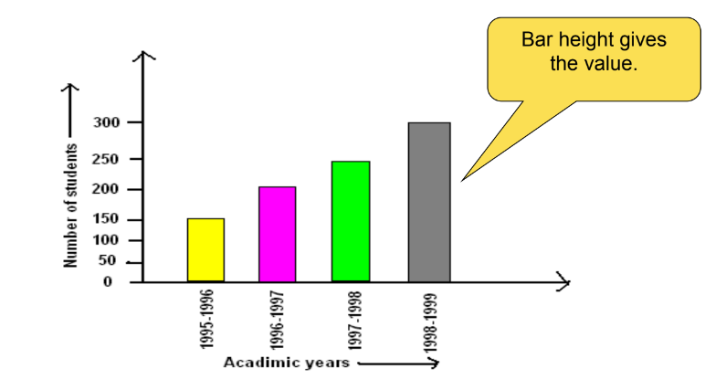
- Maximum students: In 1998-1999
- Minimum students: In 1995-1996
- 200 students in Class VIII in 1996-1997
Double Bar Graph
A double bar graph displays two sets of data simultaneously, useful for comparing data. For example, comparing the sales of different bike models in the years 2002-03 and 2003-04:
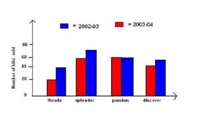
- Maximum sales in 2002-03: Splendor
- Minimum sales in 2003-04: Honda
Frequency Distribution Table
Frequency refers to the number of times a particular entry occurs. A frequency distribution table organizes data into categories to show how frequently each category occurs.
Example: Frequency distribution of students’ favorite subjects might show:
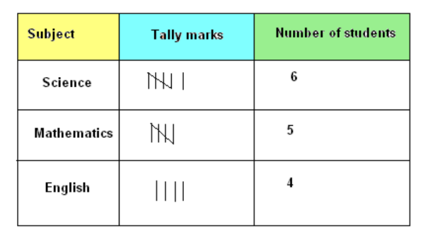
- Science: 6 students
- Mathematics: 5 students
Grouped Frequency Distribution Table: Data is grouped into intervals to summarize large datasets. For example, students’ marks in Mathematics can be grouped into intervals like 0-10, 10-20, etc.
Histogram
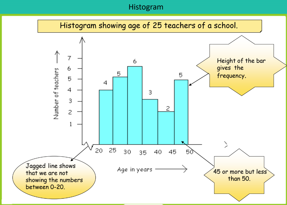
A histogram is similar to a bar graph but is used for grouped data. It shows the frequency of data within certain intervals (classes) and there are no gaps between the bars.
Example: A histogram might display the age distribution of 25 teachers at a school, with each bar representing a group of ages and its height indicating the frequency of teachers within that age group.
Circle Graph or Pie Chart
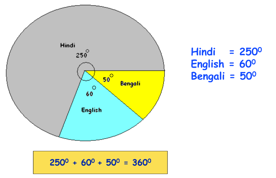
A pie chart represents data as slices of a circle, where each slice’s size corresponds to the data’s proportion. For example, a pie chart might show the distribution of languages spoken by students in a hostel:
- Hindi: 50 students
- English: 12 students
- Bengali: 10 students
The total is represented by a full circle (360°), and each sector’s angle is proportional to the data’s fraction.
Probability
Now that we know very well about Data Handling, we will learn the concept of probability.
Probability deals with the likelihood of different outcomes in an experiment. For example, when tossing a coin, there are two equally likely outcomes: heads or tails. The probability of getting heads is 1/2, as is the probability of getting tails.
Another example is drawing a ball from a bag containing 3 red balls and 2 yellow balls. The probability of drawing a yellow ball is calculated by dividing the number of favorable outcomes (yellow balls) by the total number of outcomes (all balls).
Probability is a fundamental concept that helps in understanding the chance of occurrence of different events.
Let’;s Conclude
In conclusion, Data Handling in CBSE Class 8 Math Chapter 5 is an essential topic that equips students with the skills to collect, organize, and analyze data using various graphical methods such as bar graphs, pie charts, and histograms. It also introduces key statistical measures like mean, median, and mode, along with the foundational concept of probability. Mastering Data Handling not only helps in mathematics but also enhances analytical thinking, preparing students to make sense of real-world data.
Make sure to explore all the learning resources iPrep offers for Data Handling, Class 8 Chapter 5, including animated videos, practice questions, and notes to reinforce your understanding. With these tools, you will be well-prepared for exams and future mathematical challenges involving Data Handling in Class 8 Chapter 5!
Practice questions on Chapter 5 - Data Handling
Get your free Chapter 5 - Data Handling practice quiz of 20+ questions & detailed solutions
Practice Now


